How we can build better machine learning models by using less — but more carefully curated — data
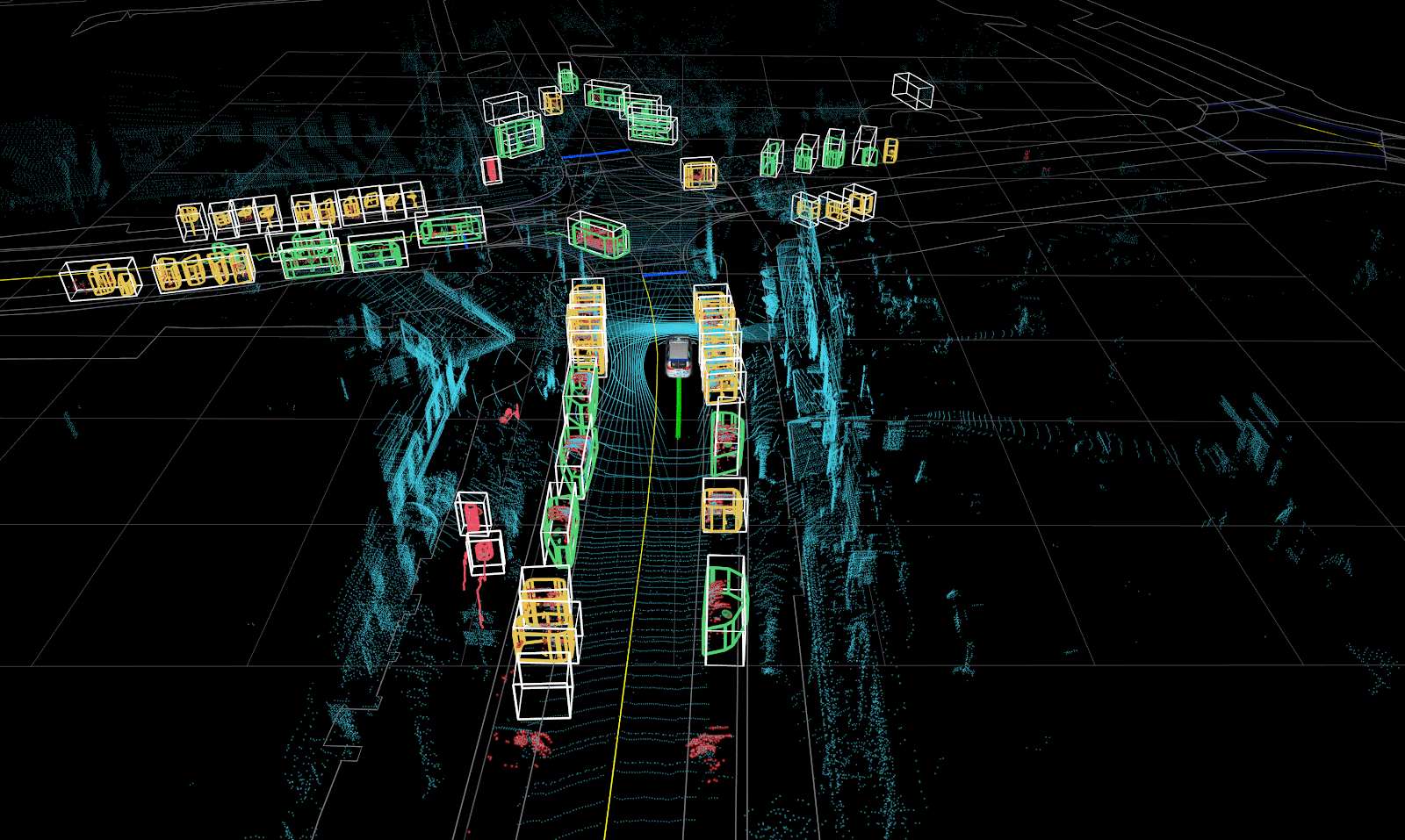
Figure 1: A typical fully labeled scene from a self-driving car. The 3D bounding boxes with class type are the labels that make up the training set.
This article was written in collaboration with Jennifer Prendki, Founder and CEO of Alectio.
The Big DataData Labeling Crisis
The field of computer vision reached a tipping point when the size and quality of available datasets finally met the needs of theoretical machine learning algorithms. The release of ImageNet, a fully-labeled dataset of 14-million-images, played a critical role. When ImageNet was realized, it was close to impossible for most companies to generate such a large, clean, and (most importantly) labeled dataset for computer vision. The reason for that was not that collecting the actual data was challenging (in fact, data collection and storage had already gotten much easier and cheaper), it was because obtaining and validating such a large volume of labels was slow, tedious, and expensive.
Data scientists know all too well that data preparation takes up most of their time, yet many people — including seasoned engineers — do not fully grasp the challenges related to data labeling. Data labeling can be viewed as the step that consists of encoding and integrating human knowledge into the algorithms. Getting it right is critical.
Some industries are lucky in that aspect because the data they are working with is “naturally” labeled. For example, in e-commerce, the label itself comes directly from the customer (e.g. Did this customer buy this specific product? What rating did the reviewer give to a specific product?). However, if you are working on a machine translation or a computer vision use case, the burden of labeling the data is completely on you. That’s why self-driving car companies, like Voyage, are putting a lot of effort, time, and money into getting high-quality labels.
An Industry-Wide Crisis
If you think this dynamic is getting better soon, think again. With the amount of data collected worldwide doubling every two years (or even faster, according to some sources), it is easy to see why manually labeling data is not scalable. The good news is that there are now good options for machine learning teams to outsource their labeling needs to companies that focus specifically on generating high quality labels. At Voyage, we work closely with Scale to achieve this.
In addition, more and more research is trying to solve the “Big DataData Labeling Crisis” by adopting semi-automated, human-in-the-loop approaches. The underlying idea, inspired by the Pareto principle, is to use a machine learning algorithm to generate labels in the easy cases, and have a human annotator handle the difficult ones. Yet, even today in 2020, most labeling is still done manually. This means that each individual record has to be reviewed by a human tasked with the job. Such a job could be marking Tweets as proper or improper content (in the case of content moderation), transcribing utterances (for a speech-to-text application), or drawing bounding boxes around relevant objects in an image (in the case of computer vision). It should come as no surprise that this process can be both time-consuming and expensive.
Labeling for Self-Driving Cars
Self-driving cars require an enormous amount of labeled data. This is not simply to ensure the models are accurate, but also because there simply isn’t room for error. Getting the correct label is safety critical. At Voyage, our perception module is responsible for observing and understanding the environment. One of the many layers within our perception module relies on a deep neural network to make sense of the world around us. This means not only detecting and classifying the objects, but also predicting where they are going. The performance of this system is dependent on the data it is trained on, and achieving state-of-the-art performance relies on a state-of-the-art dataset. Over the last few years advancements in neural network architectures, as well as improvements in the sensors themselves, have made this problem more approachable. Data collection itself is not a bottleneck in developing self-driving cars, but structuring this data is an expensive and time consuming process. Incorrectly labeling data has the potential to seriously degrade the performance of the system.
When Voyage and Alectio were introduced, we immediately saw the benefits of working together. At Voyage, we have been building our dataset for years, and as the data grows, so does our training time. Understanding which data was contributing the most to our model’s performance, and which data might be causing biases in our model, was critical to the next phase of our development. We decided to partner with Alectio to explore an approach called Active Learning in order to help us answer these questions.
Not All Data is Created Equal
There is no question that having more data is better (up to a certain point). Building a simple learning curve will prove it, loud and clear. The more records a machine learning model sees in a training dataset, the more information it will have to learn from. Still, many machine learning engineers have failed to realize a critical truth: not all data is equally valuable for a model. In fact, it is fair to believe that a significant portion of collected data is actually completely useless. Imagine, for example, that you are building a model to interpret parking signs. but your training set is a collection of all street signs. Most of this data will not be contributing to your task. Things get even trickier if your dataset contains duplicates or pseudo-duplicates; in this case, many records contain the exact same information, but only the first one is truly valuable.
Smart Data > Big Data
At this point, you might be inclined to ask, “If not all data is equally valuable, then how do I find the valuable stuff?” This challenge is even harder than it looks, since we need to identify the valuable labels without labeling the data in the first place. To showcase this problem, we created an experiment. The goal of our study was to demonstrate that picking the right data can critically impact the performance of a machine learning model.
Our Experiment
Finding What Matters
It’s no secret to machine learning engineers that more data leads to better models. In fact, increasing the size of their training set is what most researchers do whenever they are disappointed in the performance of their current model. This effect can easily be shown by building a plot called a learning curve. A learning curve is a plot of a model’s performance versus the quantity of data trained on. The metric we use to measure model performance for object detection is the industry standard of mean average precision (MAP). People usually build learning curves by incrementally increasing the size of their training set and then retraining their model. The goal is to identify how data quantity impacts model performance. In most cases, the larger samples include all records included in earlier iterations, and hence the represented samples are not mutually exclusive.
The major limitation to a typical learning curve, however, is it doesn’t capture the many different ways to sample the additional data to grow a training set. In order to understand more in-depth how the size of our training set impacted our model, we ran a slightly different experiment.
- We started by creating a small, experimental dataset of 10,000 total frames (much smaller than our overall dataset) to study how our model was performing as a baseline. Because of the overall size of this dataset, we were interested in finding relative improvements as opposed to absolute performance
- We first generated 30 different samples (independently chosen) of the same size and retrained our model
- We then repeated the same study using samples of size 40, 60, and 80 percent of the total experimental dataset
At first, nothing seemed too surprising with the results: more data led to better performance, regardless of the class we considered (i.e. vehicle, pedestrian, and golf cart). Once we dug a bit further under the hood, some notable findings stood out:
There was a significant variance across the results obtained for samples of the same size. Using different samples, each with a size of 20 percent, the metric for vehicles ranged from 46 to 74 MAP. This demonstrates that not all data is equally valuable for the model.
There is also a significant overlap between the MAP values obtained with different sample sizes. Interestingly, the 20 percent sample that performed best has an MAP higher than the average 80 percent sample. This means that a well curated 20 percent sample can lead to better results than those obtained with 80 percent of the same data.
Last but not least, we also discovered that the best 60 percent sample yields similar performance to the best 80 percent sample (especially for the golf cart class). In other words, when the sample is well chosen, adding more data doesn’t matter anymore. Likewise, the worse 60 percent sample is the same MAP for vehicles than the one for the worse 40 percent sample. Note that without a querying strategy, randomly selecting additional data, whether it has been labeled yet or not, can lead to any of the results in the violin plot. All of this brings us to an important conclusion: curation is just as important — if not more so — than data volume. The right curation process can lead to better results than those obtained with significantly more data.
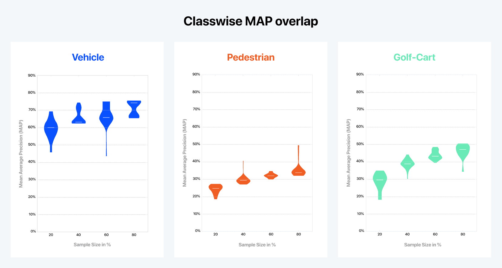
Figure 2: Results of our Active Learning feasibility study with Alectio. Representing the relationship between the model’s performance and the size of the training set with a regular learning curve has its limits since there are many different ways to select the training samples. Here, each violin plot represents the distribution (or the range) of the MAP values obtained across 30 different training processes run with the exact same amount of data (but a different training sample). We can see, for example, that training with 20 percent of the data might lead to a MAP as high as 69 percent, or as low as 45 percent, which supports the fact not all data is created equal.
Enter Active Learning
Now that we know that curation can help us tremendously, let’s go back to our original question. If data isn’t equally valuable, how do we find the “good stuff?” One way of doing this is through a process known as Active Learning. While this technique is not new, it is underutilized and misunderstood by machine learning engineers across the industry.
Active Learning consists of adding data volume progressively, re-training the model with a larger batch, and using the trained model to identify which data is the most valuable to add next. The underlying idea is to examine the model’s learnings at each iteration. One way to do this is to use the model in its current state to infer on the remaining ‘unpicked’ data and select the records that were predicted with the highest level of uncertainty. A fairly popular way to do this is to select the records inferred with the lowest confidence — a strategy known as “least-confidence.” We usually stop just as we reach the desired performance (or when no more improvement is observed as per the learning curve). Intuitively, it is like teaching a child something new by using only a small set of examples, before testing them to identify their weaknesses in order to know what examples to show next.
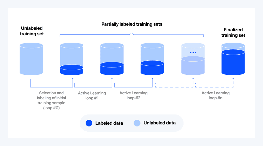
Figure 3: The Active Learning “pooling” process starts with an unlabeled dataset. We initialize the process by randomly selecting a small batch of data which we label and use to train the first loop (loop #0). The model trained on this batch is then used to infer on all remaining unlabeled data. The results of the inference process are then used to select the most “interesting” data (the logic of that selection is called a querying strategy), which is picked, labeled and added to the previous training set.
As a selection criteria for each loop, least-confidence querying uses the batch of data that was inferred with the lowest confidence in the previous loop. Unfortunately, this approach is often sub-optimal, as it might cause the selection of outliers, or oversampling of certain specific classes. So, we experimented using a twist on the least-confidence querying strategy, which still uses low confidence values but counterbalances the bad effects with some records the model was more confident about.
Analyzing the Results
It’s time to have a look at our learning curve:
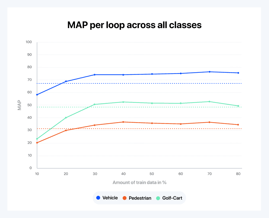
Figure 4: Learning curve split by class using Alectio’s active learning strategy.
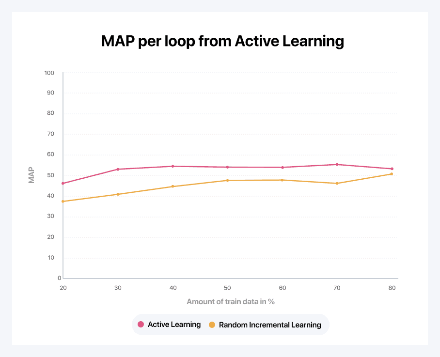
Figure 5: A comparison of a random learning curve (created by randomly selecting the next batch of data, as is normal practice) versus the smart active learning strategy.
Looking closely at Figure 4 above, our querying strategy seems to be doing a really good job. We are able to reach the nominal accuracy with only 30 to 40 percent of the data. Figure 5 gives us an alternative view on the same data. It shows the derivative of the learning curve to compare learning speeds between classes. A few interesting observations can be made from the graph:
- The golf cart class, while not the most accurately predicted one, is the one that the model learns the fastest; this is followed by the pedestrian class. This is due to the fact that the vehicle class is already reasonably well understood after the initial random loop (as vehicles are the most ubiquitous in the dataset)
- When going from 30 to 40 percent of the data, the pedestrian class becomes the class the model learns the fastest
- Eventually, all of the classes end up at the same learning rate
- Finally, above a certain point, it looks like adding more data is hurting the performance of the model for pedestrians and golf carts (given the limited size of this experimental dataset, it is likely overfitting on the training data)
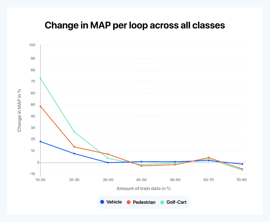
Figure 6: The derivative of the learning curve to compare learning speeds between classes.
Let’s now analyze what the querying strategy is trying to do here. In order to do so, we also draw curves to represent the relative importance that the querying strategy seems to be giving to each object class.
- After the initial random loop, it interprets the results and sees that the model already understands the concept of vehicles pretty well compared to the other two classes
- As a consequence, it decides to oversample golf carts and pedestrians, meaning that vehicles become a lesser priority for the next loop. Note that because that data isn’t labeled yet, it is quite remarkable that the querying strategy is capable of enriching the sample with specific classes. This is the exact purpose of a querying strategy, to find the best proxy possible to emulate this behavior
- Then the querying strategy seems to behave as expected throughout the learning process. For example, since the pedestrian learning curve goes from 40 to 50 percent, then from 50 to 60 percent, the system reacts by increasing the fraction of pedestrians, which is rewarded with a positive boost in the learning curve over the following loop
- The strategy seems to favor frames with many pedestrians at first, but then eventually it picks data with less pedestrians. This can be due to either the fact that the model is running out of useful data or to a change in the strategy
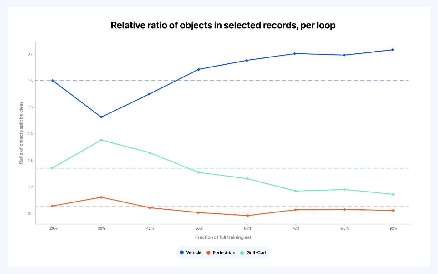
Figure 7: Each curve represents the evolution of the relative fraction of the objects in all frames selected in a given loop that fall under a specific class. For instance, we can see that 60 percent of all objects in the frames selected in loop zero are cars; this should be the ratio of cars over the entire dataset as the initial loop is randomly sampled from the original training set. Because the batch of data selected in the first loop is selected randomly, the distributions of that sample is the same as the distribution on the entire dataset. The dashed lines are meant as a reference, to show how much the relative ratios of each class depart from the original ratios in the data.
The Intuition Behind Active Learning
Let’s finish with a thought experiment. What would you do if you were given the task of dynamically curating your data in order to maximize learning in the shortest amount of time?
- First, you would start by randomly sampling your data (in fact, you might even make an additional effort to enforce that all objects are equally represented, which would go beyond random sampling). This is because at first you would not know much about how to identify the useful data
- Then, you would check the results with this first match, and you would see that your model seems to already have a good understanding of what a vehicle is, but not so much of what a pedestrian or a golf cart is
- Your next move might be to pick more ‘golf-cart and pedestrian’-rich data. You couldn’t do that, however, because without labels you wouldn’t know which data records contain the most golf carts and pedestrians. This is why the Active Learning strategy is so powerful, because it effectively can
Comparing the above thought experiment to the behavior observed using a querying strategy through Active Learning, it is amazing to see the alignment between the intuition and the implementation.
It is important to note: most Active Learning strategies are based on uncertainty measures, such as confidence level or entropy. The issue is that high uncertainty does not necessarily correlate with “informativeness”. In fact, most outliers would lead to high uncertainty, and while such querying strategies can lead to really good results, they can also mislead the model in a dramatic way. There really is no one querying strategy that fits all situations. This is why it is important to focus on identifying the right querying strategy for each scenario.


0 Comments